
Finally, on CBS, the football matches the business cards
The score bar at the bottom of the screen during a football game has an obvious function: It tells you how many points a team has scored. In some cases, such as the 2021 Chicago Bears, this function is ceremonial. Nonetheless, we primarily use the score bar as an information device.
But viewers intuitively understand it as a design object, too. Each network’s score bar has its own feel, and broadcasters use that feel to shape your experience of the game.
The EXTREMELY ITALIC visual language of Fox’s graphics package frames the sport as a fast-paced video game, and the compact dimensions of the scoreboard allow the network’s look to translate gracefully from a TV to a vertical phone screen. (I’ve previously detailed my admiration for the shrewd, device-agnostic design choices of Fox Box 2020.)
NBC has the marquee primetime slot and employs a graphical approach to match. The look of Sunday Night Football’s score bar casts the game as an epic drama. Every element of the score readout appears to glow. Gratuitous streaks of light spill from the timeout indicators along the bottom, evoking the awesome high-contrast radiance of stadium lights after dark (in particular, those lights as seen through a movie camera). Areas of shadow heighten the contrast and add dimension to suggest the stadium’s depths. The team logos looming in those depths are huge, too big even for the very parallelograms NBC has built to contain them, giving a larger-than-life air to the gladiators on the field.
Amid its grandeur, NBC also maintains touches of subtlety—such as the tiny possession indicator above each team’s score—and refinement, such as that exquisite ampersand. Go on, try to find a more graceful down-and-distance ampersand. You can’t. That ampersand is a little butler, gently pouring you a teacup of chamomile football.
Whether or not they suit your personal taste, the Fox and NBC designs at least tell a coherent story. I struggle to say the same about CBS’ 2021 redesign. I call it a “redesign” for lack of a better word, but it falls short of the overhaul that "redesign" might imply. Instead, the new CBS look is a peculiar, half-hearted paint job applied to the perfectly good graphics package CBS had used since 2016. It's an iPhone 13 sort of update, with no compelling reason to exist other than somebody decided it was time for it to exist.
The previous, understated CBS design was characteristic of the network’s visual tradition: “Welcome to football on CBS, now let us get out of your way.” Usually, CBS’ approach to a football-graphics redesign has been to look at whatever Fox was doing a few years ago, strip away any flash or gimmickry, and drench the austere skeleton that remains in a coat of CBS blue.
And there’s nothing wrong with that. For the last couple of decades, the result of this process has been a long succession of on-screen scoreboard designs that were clear and unobtrusive. And, to various degrees, blue.
Over the years, as it continued to sand down the trailing edges of broadcast design trends, CBS built a reputation as the network that was trying not to distract you from the action. This niche fits CBS’ more buttoned-down culture vis-a-vis its competitors. The NBC peacock promises a big colorful show, but the CBS eye promises you the best view of the action. A boring, quiet graphics package suits the latter approach.
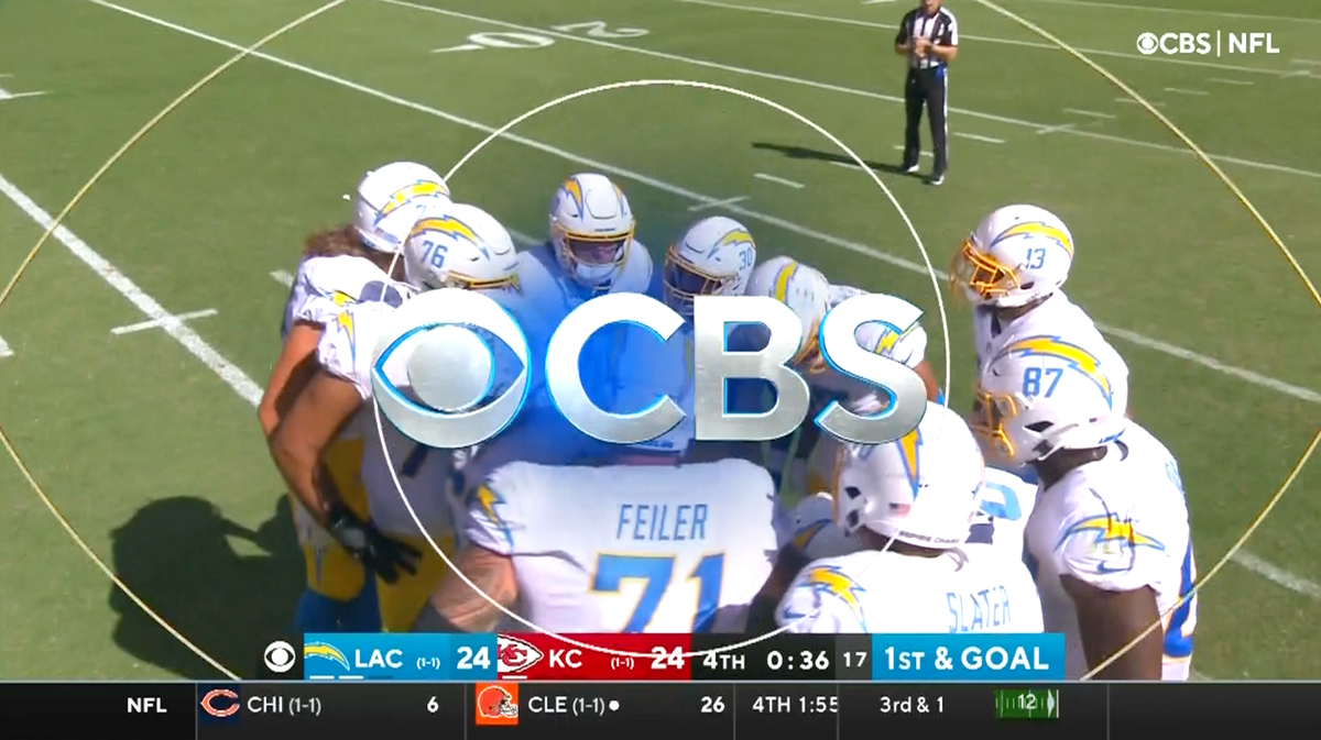
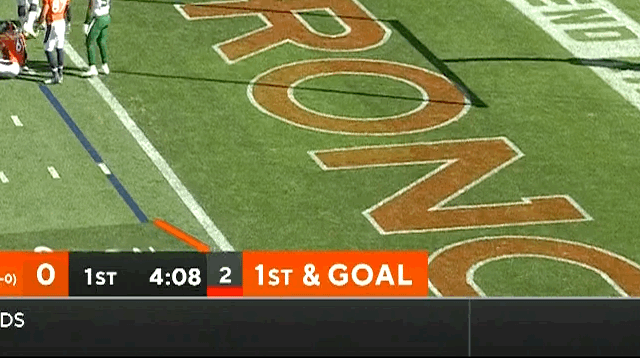
Yet in the 2021 revision, CBS’ look has become boring and loud, which is a less appealing combination. The new design is “simpler” in a superficial sense: CBS has embraced the flat look that you may recognize from every corporate branding makeover of the last five years. That means designers ruthlessly eliminated the borders and faux-3D details of the 2020 graphics. Everything that remains is unrelentingly bold. I don’t mean “bold” as in “daring.” I mean “bold” as in, someone dragged their cursor over the old design and hit Control-B.
In a February interview about the new football graphics, head of CBS Sports visual design JP LoMonaco told NewscastStudio, “We were sort of a rebrand within a rebrand,” a quote that I think captures the excitement of the whole enterprise. LoMonaco was explaining that the aesthetics of the graphical makeover were not dictated by the needs of the telecast itself, or by any new ideas about how sports ought to be presented on TV; rather, they were dictated by a company-wide memo to make everything on CBS look like everything else on CBS. Of course, that’s not exactly how LoMonaco put it. “It was great,” he said instead.
Just take what we have and CBS the ever-loving crap out of it, seems to have been the brief for LoMonaco’s design team, and the drive to make the graphics as CBS as possible extends all the way down to font choice. I don’t mean to upset you with my scorching-hot invective, dear reader, but I have to give it to you straight: I don’t care for this font. Although I’ve tried to give it a chance, the thick, generically friendly lettering of the 2021 design doesn’t look like football to me. It just looks like “CBS,” because it’s the same font the network uses to brand its news shows, comedies, and paint-by-numbers crime procedurals. The name of that font is TT Norms, a perfect detail that illustrates the larger folly here: Football isn’t normal. It is an outlandish spectacle in which men of unreal speed and size wage a pretend war with real violence.
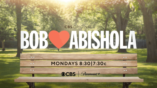
For that reason, I believe networks have the most to gain when (like Fox and NBC) they design the look of their football broadcasts as an offshoot of the main brand, a special case with its own set of rules, and not just another product on the ol’ time-slot assembly line. The 2020 CBS graphics may not have been flashy, but they still honored this specialness—they looked as if they were designed for the purpose. The new graphics do not. You’re failing to making the most of football’s singular energy when you tell an NFL story with the same visual language you use to plug this week’s repeat of Bob Meets Abishola.
Given that the CBS Sports designers faced marching orders to make everything flat and to use this all-caps font that shouts everything with the corporate-cheerful air of an overeager Applebee’s server, they had precious little room to innovate (in their defense). Amid these constraints, the most prominent sign of life in the new score box is its forceful, and ultimately rather hamfisted, use of color. The crucial statistics appear on screen in hard-edged rectangles of bright, saturated hues that jut into our view of the field. I find the aesthetic cartoony and inelegant, as if the Spongebob trappings of last winter’s NFL-on-Nick experiment made their way to the grownups’ broadcast.
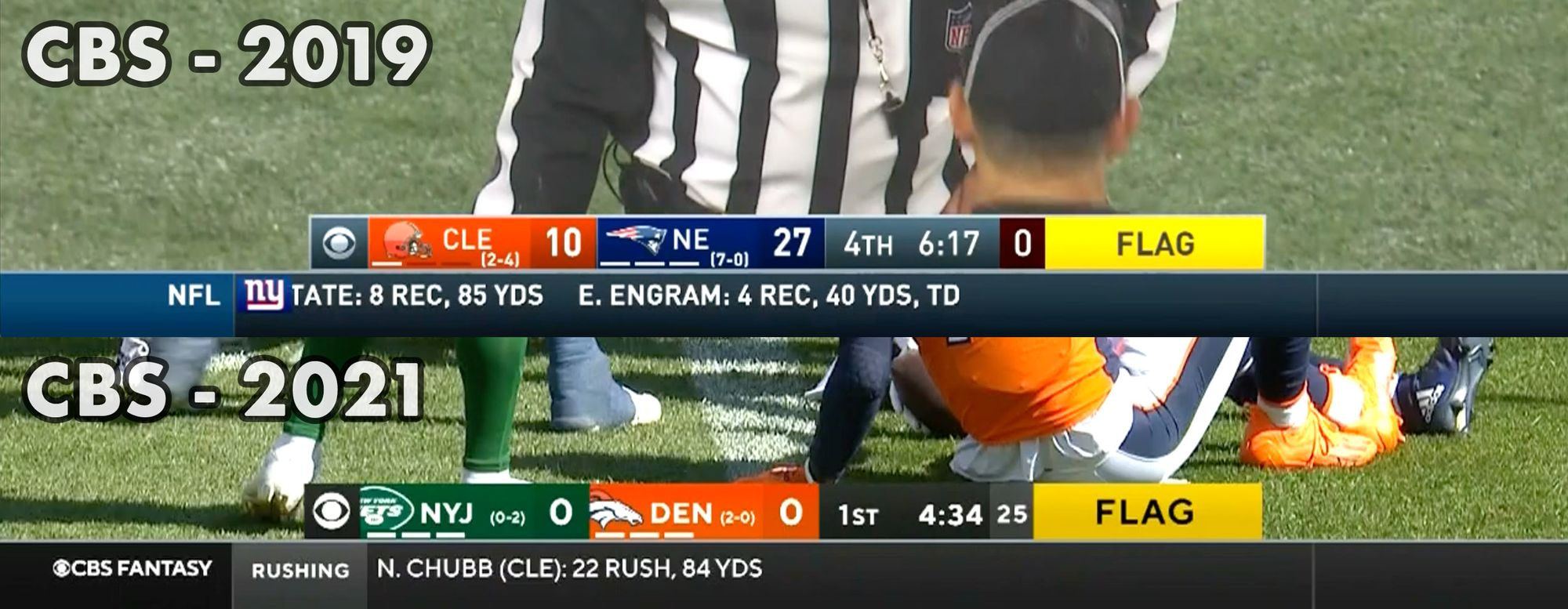
If you compare the new look to the previous design, you can see that the big rectangles of color were there before, too, but they were contained and harmonized within a larger aesthetic logic. The gray bounding lines around the score display, and a judicious use of gradients and shading throughout, blunted the hard edges of the old score box’s color fields so that the overall composition was prominent without being intrusive—which is, historically, the CBS way.
The 2021 package strips away those niceties and does nothing to replace them. The overall effect is harsh, and some of the details are sloppy—for example, note how, in the screenshot comparison above, the old design's game-clock text “4th 6:17” is perfectly proportioned to its holding box. Then look how awkwardly the new game clock occupies the same area, with “1st” and “4:34” set adrift like two bars of soap in a bathtub. That’s what happens when you graft a one-size-fits-all set of branding guidelines onto the bones of a design that had been artfully crafted for its particular purpose.
But it should also be said: I’ll get used to it. Few TV-sports redesigns are bad enough to actually deter viewers, even nitpickers like me. Because, what, am I going to stop being addicted to football because I find CBS’ take on Bronco Orange a bit strong for my tastes? No, thank you. The fact is, I like the CBS graphics a bit more every week, on account of I have fun watching football, so every week a little more of my subconscious associates the new design with fun. NFL broadcasters enjoy the luxury of a relatively captive audience.
That’s why the aimless mediocrity of CBS’ 2021 paint job galls me so much. Since it would be tough to mess up a redesign badly enough that it would actually make a difference in viewership, why not at least attempt to create something great? Past CBS graphics have done exactly that—they were boring, sure, but they were boring for the viewer’s sake. They had a certain philosophy behind them.
The 2021 look, conversely, is an exercise in corporate hegemony. Its purpose is to make the design of the on-screen product match some C-suite honcho’s business card, so he can say at the next board meeting, look, we have a coherent strategy, because everything’s the same font. The viewer, once the focus of CBS' visual design, has become a mere pawn. If I wanted to be a pawn, I’d put on a pawn costume and find one of those life-size chessboards—you know, the kind they have in botanical gardens and such. Or maybe an outdoor mall would have one. Anyway, the point is I don’t want to be a pawn, or at least that was my original point, but the more I talk about it, the more fun it sounds. So, okay, CBS, you win this round, somehow.
Postscript: considering the ampersand
I almost forgot! What about the most important part—the CBS ampersand?
Oh, it’s a beauty. Whatever the other failings of this redesign, the ampersand is a winner, a full-bodied, chewy soft pretzel of a thing. I want to bite into that ampersand and feel its warm, doughy goodness fill the spaces between my teeth. Mm-mmm, that’s some mighty fine punctuation.
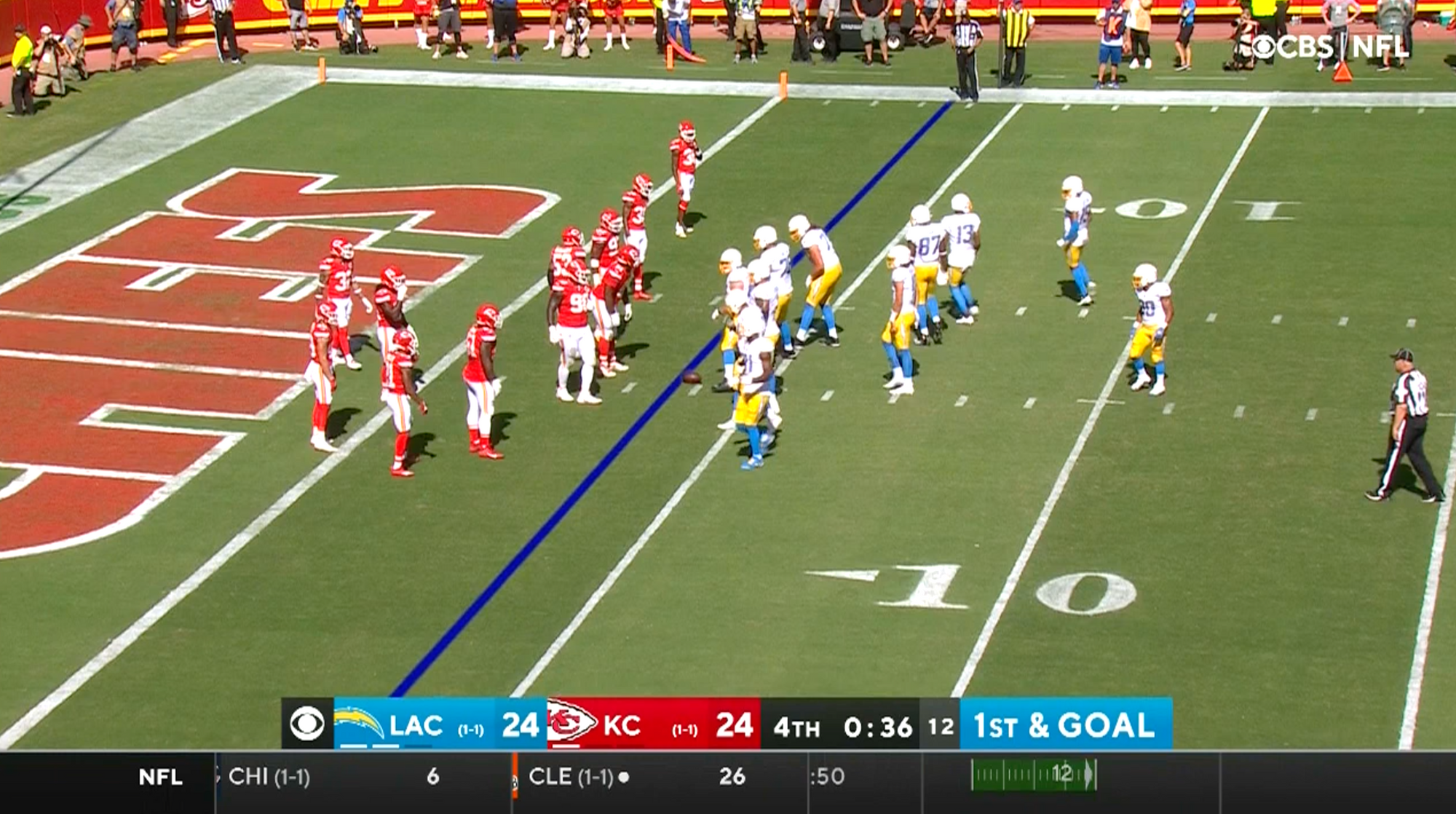
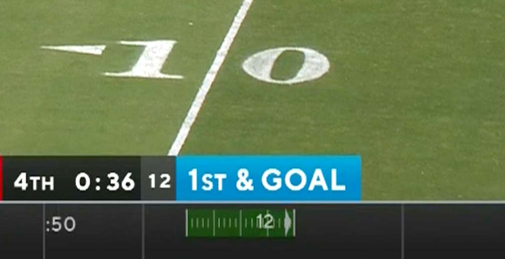
Except, hold on—once it’s “2nd & goal,” the down-and-distance text, including the precious ampersand, is squished to make everything fit in its little box. It's like this whole scenario comes as a surprise—“Yikes, there’s a second down?”—so some hapless production assistant was asked to slap something together in a hurry. "Just fiddle with the settings in Microsoft Word until it looks okay." As a result, now the ampersand is one of those soft pretzels you get at the airport, all compressed and sad and weirdly moist. I'm not even hungry for ampersands anymore.
Why did the designers have to squash and stretch at all? They’re in charge here! Why didn’t they just… design the type so it looks good on every down???
Pardon me for a moment while I locate a paper bag to breathe into.
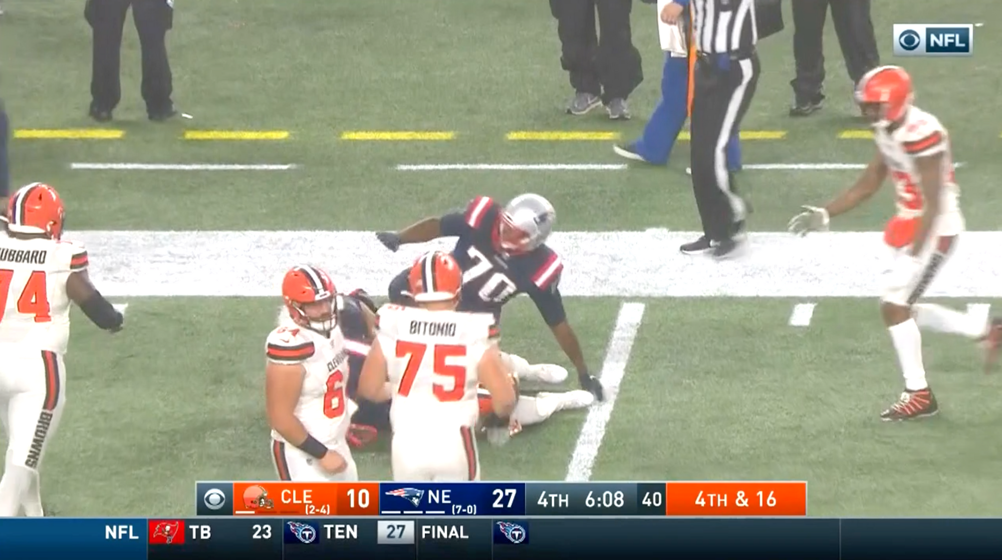
Your Week 3 star of the little window next to the Geico ad: this guy standing up at the Patriots game
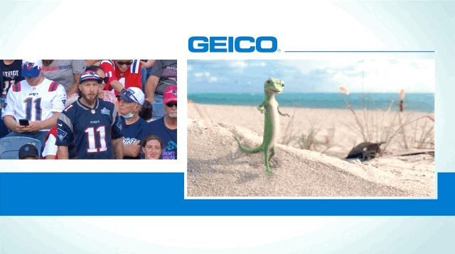
In 2019, NFL broadcasters began the practice of keeping a live picture of the field on screen, alongside an ad, during 30-second timeouts. At first this seemed like an incredible gift, as if someone had slipped up. We all noticed the loophole: If we simply fixed our gaze on the left side of the screen, why, it would be as if there was no commercial break at all! At last, the home viewers were beating the system.
Before long—moments later, I mean—everyone realized that the players spend the timeout milling around waiting for football to start again, because what else would they do, and this is not so exciting to watch. Thus the spell was broken. “At this point, I might as well just watch the professionally produced commercial in the somewhat larger window over there,” the canny broadcasters want us to say. No, don't! That’s the trap! Yet many of my fellow home viewers do indeed break our unspoken pact—they look at the commercial. They can’t help it. They want to see the insurance lizard talk to the crab.
I remain a committed left-windower. There is no discernible reward to watching a third-string cornerback idly adjust his shoulder pads, but the lack of payoff is what appeals to me. Little Window Next to the Geico Ad is calm, a show-within-the-show that offers an unassuming slice of NFL life. Also, I find it difficult to look away from anything resembling football on TV. That’s the true left-window crowd—hopeless football addicts.
In Week 3, the standout star of Little Window Next to the Geico Ad was one New England Patriots fan who featured in his own 10-second sitcom. The show's opening shot (and only shot): The camera pushes in on our everyman protagonist at the local football stadium as he realizes that he is standing up while everyone around him has already sat down. How to escape this awkward predicament? The fan decides he will grimace and gesture vaguely to make it appear that his excessive standing was motivated by righteous anger at some injustice he witnessed, over there, near section 24. “Blarrr! Grahhh!” he says, we can assume, as he sheepishly sinks into his chair. His friend mumbles agreement with a supportive shake of her head, not really listening, just happy he finally sat down. Laughs, applause, roll credits.
Little did this Patriots fan know that his zany yet relatable standing-up antics had just entertained degenerate football junkies across our great land! It was the most exciting thing that happened to any New England Patriots fan that day.
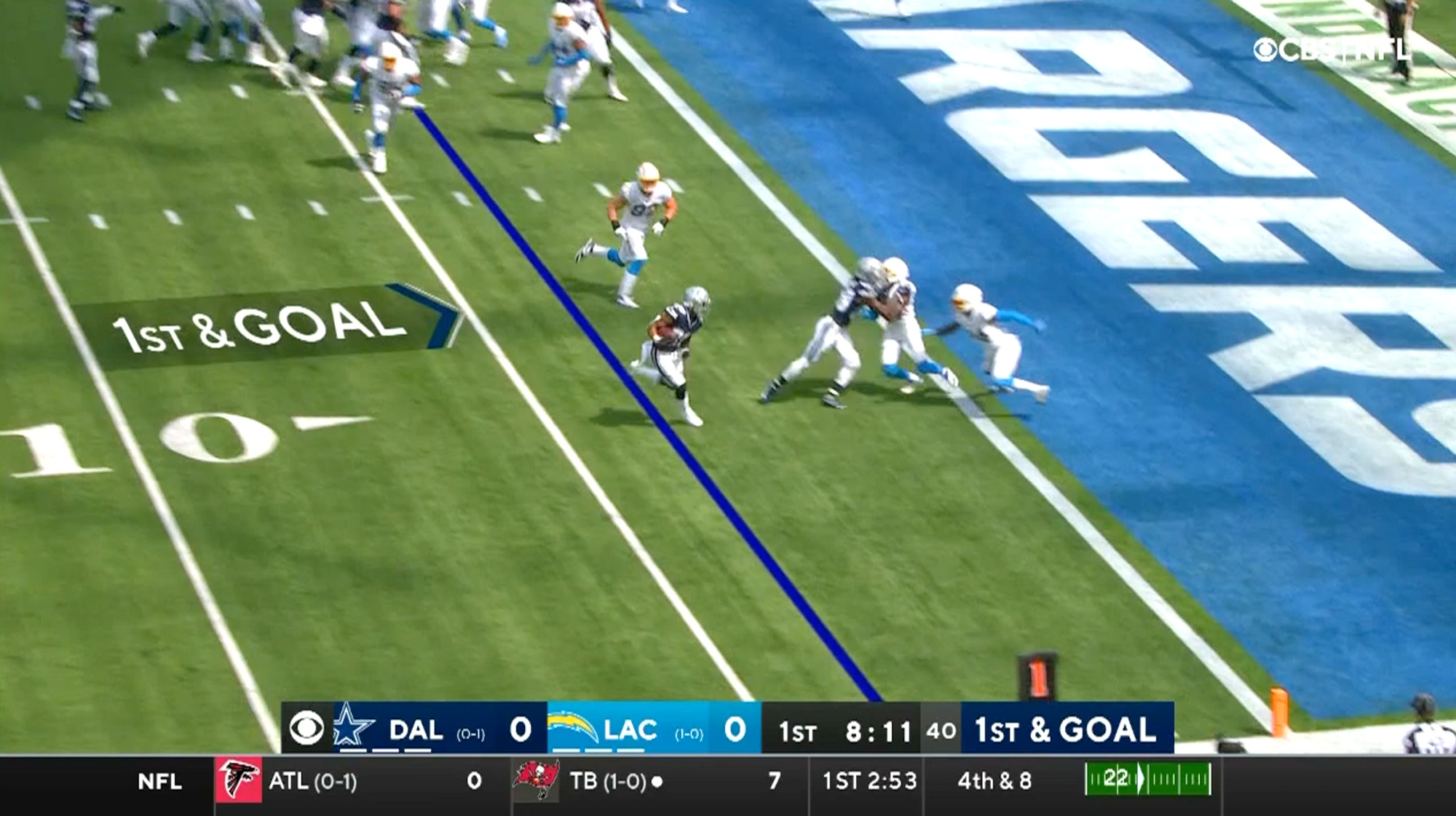
Hero of the week: The Bucs-Rams first-down marker
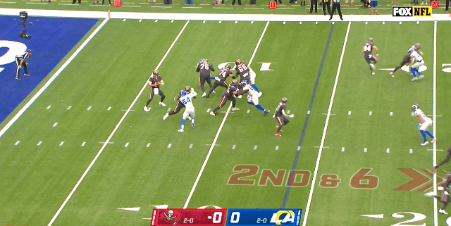
Watching the game on television, we rely on the digitally superimposed first-down line, but for the players on the field, the most vivid indicator of the line to gain is an eight-foot stick with an orange pennant attached, and the pennant has stripes, and there’s a bullseye on top.
At Sunday’s Tampa Bay Buccaneers-Los Angeles Rams game, as at every NFL game, one brave, foolhardy soul undertook the job of holding the first-down marker while wearing the customary black-and-yellow-striped vest. The vest is a remnant of 19th-century football rules, in which this role would have been held by a beekeeper, who tended the hive of angry bees used to mark first down. This custom was abandoned—the hive was cumbersome to move when a team reached the line to gain, and many players were stung by angry bees. The bees had to go, but the yellow-and-black vests remain as a warning that they may return, at a time of their choosing.
Without an army of stinging minions to do their bidding, the first-down-marker guys are defenseless out there, a reality that became all too vivid to our Bucs-Rams bee-person on Sunday, as Tampa Bay tight end Cameron Brate and a small legion of Rams defenders careened toward the general area of the first-down marker.
Then came the heroism. Sensing the danger, the first-down marker itself courageously threw its spindly, floppy body in the path of the oncoming athletes. This split-second decision allowed the bee-person to scurry toward safety. Meanwhile, the heroic marker suffered undoubtedly brutal injury when Brate rolled over it, and one of the Rams stepped on it. Fox's parabolic mic operator happened to be perfectly situated to pick up our rattled bee-person shouting, "Jesus!" to his friend nearby. But no, this was no divine intervention, just the quick thinking of a very brave inanimate object. Without the first-down marker’s sacrifice, it is hard to say how many people would have been killed by this shocking outbreak of football on a football field. Congratulations to the Bucs-Rams first-down marker. You are the Doink-O-Rama Hero of the Week.
Your guaranteed-correct Week 4 picks, as computed by DORPFASTCALC
The football picks featured in Doink-O-Rama are guaranteed to be correct, as they are calculated by the Doink-O-Rama Pro Football Anticipation Satellite and Tip Calculator, or DORPFASTCALC. The all-seeing, all-knowing eye of the DORPFASTCALC robot observatory gazes down on us from outer space, free from the earthbound concerns that cloud our judgment as we try to pick the winners of footballs games. Fools! Cease your vain and futile prognostications! Only DORPFASTCALC can foretell upcoming NFL matchups to a degree of absolute scientific certainty, barring aberrations.
In its Week 3 picks, true to its ironclad guarantee, DORPFASTCALC correctly predicted the result of nine football contests.
There were six aberrations. Somebody sneezed on DORPFASTCALC's lens. Ground controllers assure me that this source of uncertainty will be eliminated just as soon as they find the little microfiber cloth that came in DORPFASTCALC's box. They think it's in a drawer somewhere.
Week 3 picks record: 9-6
Season to date: 16-14. Science works!
SUNDAY — EARLY GAMES
Kansas City Chiefs vs. Philadelphia Eagles (CBS): Kansas City 35, Philadelphia 19.
Carolina Panthers vs. Dallas Cowboys (Fox): Carolina 21, Dallas 20.
Tennessee Titans vs. New York Jets (CBS): Tennessee 5, New York 2.
New York Giants vs. New Orleans Saints (Fox): New Orleans 28, New York 14.
Cleveland Browns vs. Minnesota Vikings (CBS): Minnesota 27, Cleveland 24.
Detroit Lions vs. Chicago Bears (Fox): Detroit 24, Chicago 6.
Houston Texans vs. Buffalo Bills (CBS): Buffalo 31, Houston 17.
Indianapolis Colts vs. Miami Dolphins (CBS): Miami 21, Indianapolis 15.
Washington Football Team vs. Atlanta Falcons (Fox): Washington 24, Atlanta 21.
SUNDAY — LATE GAMES
Seattle Seahawks vs. San Francisco 49ers (Fox): Seattle 30, San Francisco 23.
Arizona Cardinals vs. Los Angeles Rams (Fox): Los Angeles 24, Arizona 21. Even though the job of first-down-marker-holder is a perilous one, as we have seen, it would great job for a player on What’s My Line?, the classic game show in which a celebrity panel tries to guess a contestant’s occupation. In September 1952, Los Angeles Rams running back Tommy Kalmanir appeared on the show to promote a preseason exhibition against the New York Giants. Surely Tommy was excited to stump the panel and savor his moment in the national spotlight. Instead, panelist Arlene Francis (who happened to be wearing a CBS-branded eye patch for this taping) guessed Kalmanir’s line before the game even began. Kalmanir wouldn’t play a single snap that season. Arlene really did a number on the guy.
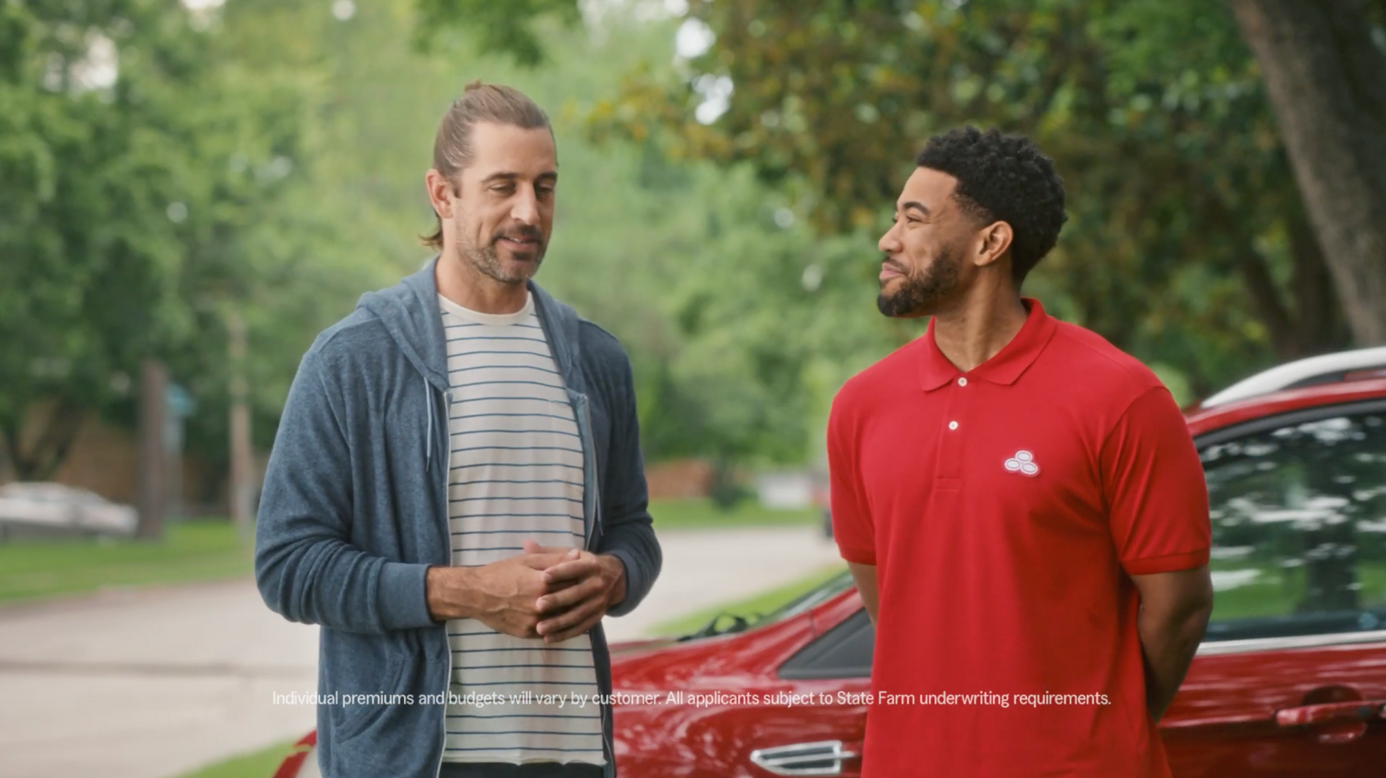
Pittsburgh Steelers vs. Green Bay Packers (CBS): Green Bay 31, Pittsburgh 20. Last week’s column featured a conversation with the pseudonymous advertising executive Ad Man X, in which he and I agreed that Aaron Rodgers looks like a slob in his latest State Farm insurance commercials. Longtime reader Patrick S. writes in with a rebuttal: “Aaron Rodgers looks terrible, but I really like it. More stone cold weirdos in football, please.” It’s true, weird is good. Point taken, Patrick!
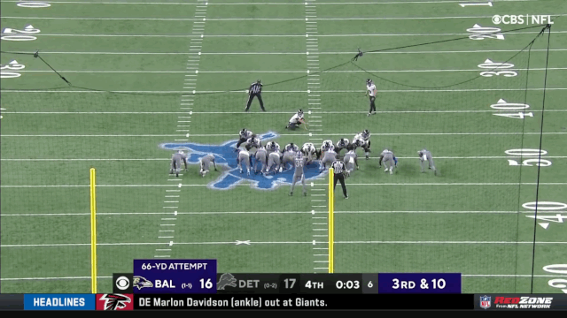
Baltimore Ravens vs. Denver Broncos (CBS): Denver 27, Baltimore 25. As noted by a number of correspondents to the Doink-O-Rama inbox, the spectacular end of the Ravens' Week 3 contest against the Lions—in which Justin Tucker set an NFL record with a successful 66-yard field goal—was made even sweeter by the fact that the ball was a doink, bouncing off the crossbar and adding a hilarious moment of suspense to the game-deciding kick. It may be the most significant doink in NFL history. May its legend never die.
SUNDAY NIGHT FOOTBALL
Tampa Bay Buccaneers vs. New England Patriots (NBC): Tampa Bay 27, New England 14.
MONDAY NIGHT FOOTBALL
Las Vegas Raiders vs. Los Angeles Chargers (ESPN): Los Angeles 33, Las Vegas 30.
Keep on long snappin'
Doink-O-Rama is a free subscription for the foreseeable future. If you want to help me out, share the column with a friend who might like it.
Reach out with your questions, observations, or doink sightings by emailing: doink at ological dot net.
Thank you for reading. Until next week: Keep on long snappin’.
